
IN-APP LEARNING CENTRE
SNAP Financial Group
UX + UI Design (Figma) • User persona development • User research • Workshop Facilitation • Prototyping • Visual concept presentations • QA testing • Liaision with developers • Iconography • Typesetting • UX Writing • Collaboration with product manager, developers, CS, sales and marketing teams
Background
SNAP Financial Group provides financing options to home improvement dealers to offer to their customers more flexible ways of paying and increase their closing ratios. SNAP support their dealers with regular promotions, deducted customer service, marketing support and training.
Problem
How might we help dealers better understand their financing options?
The sales team identified that many of our home improvement dealers were lacking the understanding of our products and therefore did not have the resources to propose those options to their customers. Data showed that many dealers had been at SNAP for a long time but were not using our products. The dealers had access to SNAP Central App, a mobile and tablet accessible app to that enabled to complete the financing process with their customers right from their device. It allowed them to review payment options with their customers and to get instant approvals. The sales team were finding that some dealers were not using the app or simply did not understand how to use it to submit financing applications.
Opportunities
For users:
An improved experience would help dealers better navigate the app and understand the value proposition of offering financing options for their business.
For the business:
An increase in financing applications, higher retention rates and revenue as well as a reduction in customer service calls and time spent onboarding.
Challenges
Limited existing user data and lack of understanding of our users and their end-to-end journeys. The Learning Centre (LC) would need to be designed in English and French.

Discovery Activities
To gain a better understanding of our dealers and their pain points, I conducted interviews the sales team. One of our first discoveries was that there was no streamlined onboarding or training process for new dealers. Each sales member had a different tool and presentation for communicating with dealers and the information was inconsistent across the board. There was no process for touchpoint along the dealers’ journey - this meant that some dealers had even forgotten they had partnered with us. During our research with the customer service team, we identified key issues our users were facing: fear of change and new technology/processes, uncertainty for how to offer financing products, lack of time and lack of understanding of financing.
Product Recommendations
Based on the interviews, the product and marketing teams made the recommendations for developing user journeys and personas and an in-app LC. We believed that the user journeys would help uncover key information about our users and would allow us to templatise automated communications. The LC would be a powerful tool for users to engage in learning and empower themselves and their business. It would also be a great tool for sales staff when selling our products and for customer service to direct users to one-stop-shop of commonly asked information.

Building Personas + End-To-End Journeys
Using the information gathered in the interviews, I led a brainstorming workshop for the marketing team to determine what our current understanding of users was. I ran a series of white boarding sessions in which we narrowed it down to 3 main type of dealer personas and what we understood were their opinions, motivations and challenges. We identified what could be keeping them from reaching their goals and what would be the best way to communicate with them. We collaborated to create end-to-end user journeys in Salesforce where we mapped out each touchpoint and and what document or communication would correspond with that. We created an automated pipeline of email communications such as sign up, onboarding, loyalty and lapsed accounts.

Planning Stage
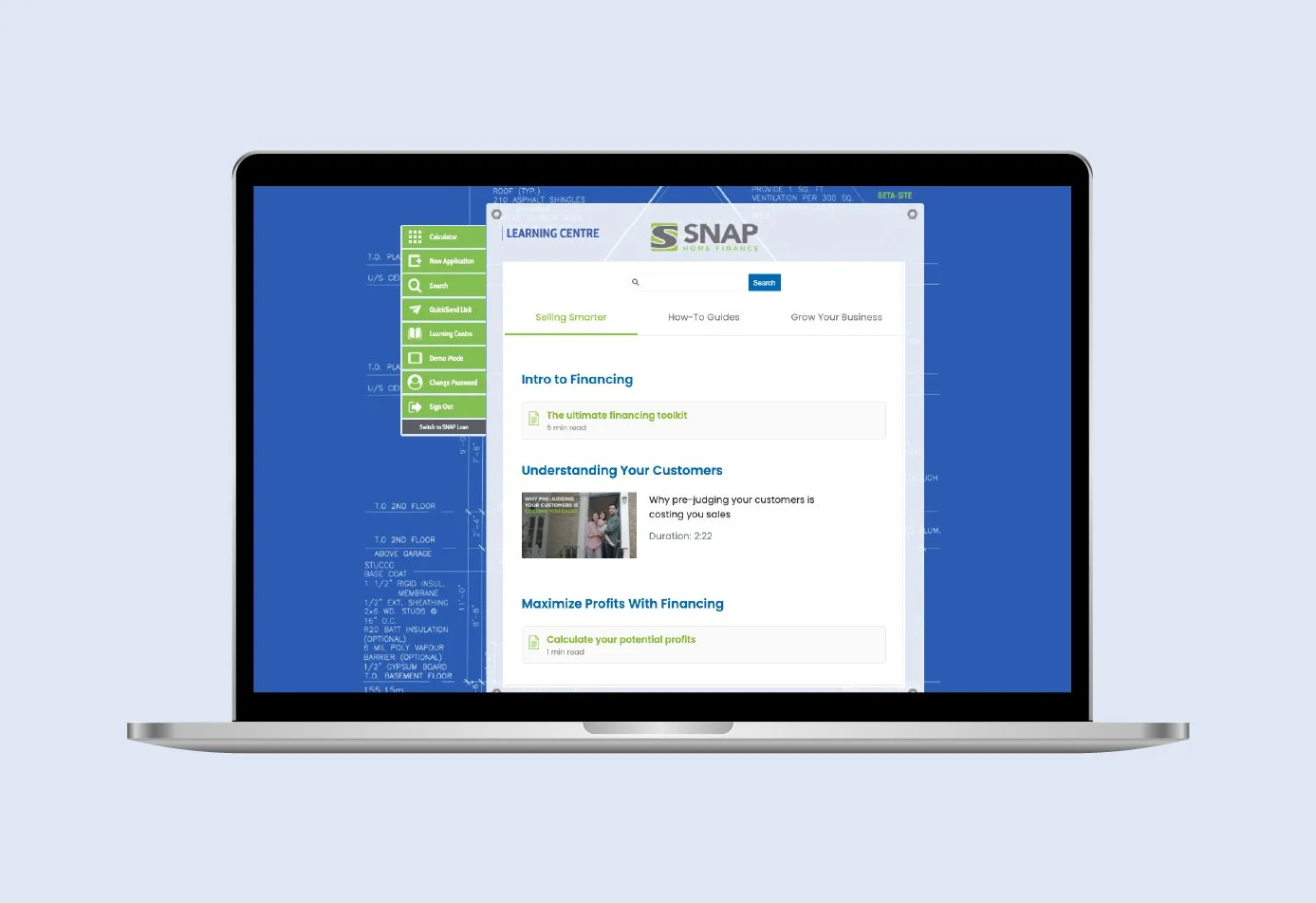
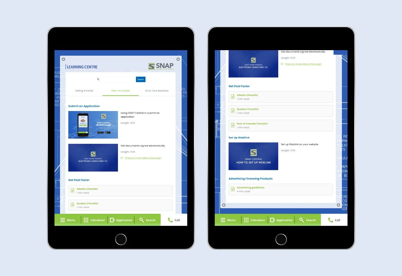
Once we had decided on what information and resources should live in the Learning Centre (LC) based on interviews and user persona needs, we created an information architecture with 3 learning sections. The first section was aimed at “Reluctant Roy” who is not convinced on the benefits of financing options and finds the products confusing. This included a Financing Toolkit outlining financing terms and SNAP products, a video explainer to help alleviate worries about offering financing to customers and a calculator worksheet to help users figure out what their potential profits would be.
I created a work plan for the resources that would need to get created such as videos and PDFs so that we could work simultaneously on these in order to meet the app release deadline. I did some script writing and art direction for the videos and designed a downloadable Financing Toolkit and checklists for each province. We also developed guidelines to assist our users advertise financing products to their customers.
Design Stage
Based on our information architecture, I collaborated with the product manager to create low-fidelity mock ups of the LC, adhering to the app’s existing design systems. We designed screens for mobile, iPAD and desktop and created different interactions and UI according to the device.
During early stages of prototyping, I led and presented to the sales team to get their feedback and recommendations based on their knowledge of the user. Based on these conversations, we decided to add a “search” function to the top of the LC to enable users to access the information more efficiently and quickly, as we knew that our users were often strapped for time. We added tags to each content piece and linked it to common words and commonly asked questions.
I designed interactive prototypes to work with developers and took part in usability testing. When users search for something, results of the most accurate matches displayed onto another page. We tested the app prototype with a select group of dealers to gather feedback on how they interacted with the app and what they found helpful.

Key Learnings
This project was a big learning milestone for me as I had limited UX and product experience prior. It was a very interesting experience to design for a group of users I was not familiar with and it ignited this passion to understand people and what affects the choices they make in their lives, to be able to alleviate some of stressors and frustrations.
Leading workshops and presentations was a great practice for me, who had previously been more introverted and shied away from public speaking! I enjoyed collaborating with different teams and using everyone’s strengths and expertise towards a common goal. I developed a greater understanding for backend development and app/product lifecycle. Apps don’t always behave in the way we had planned them for to and it’s an exciting challenge to come up with solutions.
This project was a pivotal moment for me in taking my career into a digital and UX/Ui direction and to design from a human-centred perspective.